
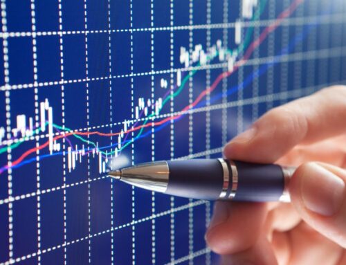
If you have tried the graph packages offered by your broker and other services, you soon realize how fortunate we are to have VectorVest graphs. Firstly, for me, the Candlesticks are so darn visually appealing! The vibrant colours of the red and green Candlesticks against a black background leap right out at you.
VectorVest Candlesticks deliver a lot of information about investor sentiment and a stock’s direction and momentum, and they do it in a quick and easy manner. They tell investors and traders a whole lot more than a basic line or area graph, and a lot more than the OHLC Layout, which is dull by comparison. And VV7 graphs are always easy to read, especially when you have your default Span setting on “Best Fit.”
Best Fit is an exclusive VectorVest feature created to always give you a highly readable, great-looking graph. It determines the size of the graph and the number of Candlesticks to display from the size of your computer screen. No matter what the frequency, Intraday, End of Day, End of Week or Weekly, click on Best Fit, and you get a beautiful, proportional, readable graph.
END OF WEEK vs WEEKLY
Hang on. What’s the difference between the End of Week and Weekly graphs? The answer leads us to another impressive and valuable feature in VectorVest – the Weekly Graph. I got help with the explanation from Tim McGrath, one of our brilliant Software Developers who wrote the code several years ago.
Most investors are familiar with End of Week graphs. They only show data from the last trading day of the week, making them a lot more “gappy” because they skip four points of data each week. Compare that to the Weekly graph where the accumulation of data from the beginning to the end of each week is displayed in a single Candlestick or bar.
“So, the open,” Tim says, “ is the first data point from the Monday of each week, and the close is the final data point from Friday of each week. The high/low is the highest and lowest points during the entire week.”
SO MUCH BETTER
This reveals considerable differences in appearance when these graphs are compared. Weekly Candlesticks are fuller and less gappy than End of Week. Investor sentiment, patterns and trends are revealed more clearly and easily. It’s fantastic!
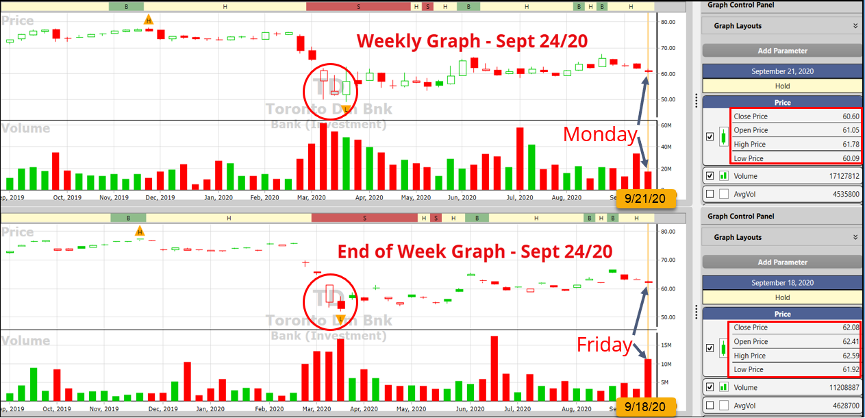
Click or tap image to enlarge
VectorVest has seven pre-set Graph Layouts you can choose from. The default Layout will produce a Best Fit, End of Day graph showing daily Candlesticks of Price, a 40-Day MA of Price, RT and daily Volume. You can make top-notch Buy and Sell decisions with this Layout on its own or toggle on EPS for longer-term trades where fundamentals are more important.
DR. DILIDDO’s FAVOURITE LAYOUT
VectorVest Founder Dr. Bart DiLiddo has stated that the Enhanced ProTrader Timing Graph with the DPO and MACD is what he uses for just about every decision. Amazingly, it is one of the default graph selections even though it uses ProTrader Graphics, but you don’t need ProTrader. You will not have the ProTrader technical searches unless you are a Real-time subscriber, or you purchased ProTrader separately, but the ProTrader technical indicators for graphs are included with every subscription.
I also like the Enhanced ProTrader Timing Layout, and I start with the Weekly Graph. I remove the envelopes and add RT above the DPO, keeping MACD at the bottom. I can toggle Volume on and off, but I prefer it off until it’s decision time.
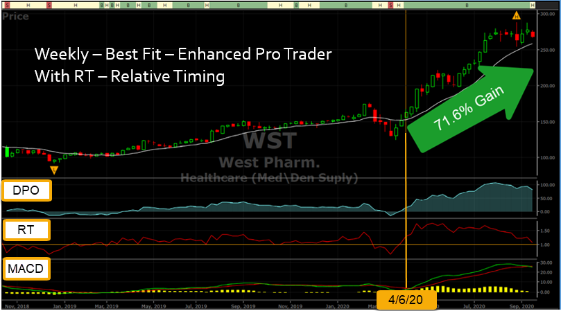
Click or tap image to enlarge
For a BUY, I want RT crossing or holding above 1.0, and either the DPO or MACD, or both, just turning positive or holding. DPO for entry, at a minimum, should be rising, not falling. When you have at least two of these three conditions lining up, and price is acting properly, you have the odds in your favour for a good trade. In this case, it’s true what the songwriter wrote, TWO OUT OF THREE AIN’T BAD.
P.S. I have created a short video to explain and demonstrate a few tips and best practices with Best Fit, Weekly graphs and the Enhanced ProTrader Timing Graph. Please CLICK HERE to watch on our VectorVest YouTube Channel and be sure to click on the LIKE button and also SUBSCRIBE if you appreciate content like this.


Leave A Comment