

The Performance Graph might be one of the most underrated tools in VectorVest. Once you start using it, you’ll likely decide it is one of the most valuable. Exclusive to VectorVest, the Performance Graph allows you to compare the performance of any Stock, Industry or Sector compared to any other Stock, Industry, or Sector over any timeframe.
How Does it Work?
Just like a QuickTest, the graph presents the percent price change from the starting point on the graph to the end date. The Performance Graph, however, gives you so much more information because you can see the stock or ETF’s “equity curve” as it moves from left to right. How smooth or volatile is it? How did the stock perform over long and short timeframes compared to other stocks, including those within its Industry Group or Sector? Is the current trend up or down?
Here are three of my favourite ways you can use the VectorVest performance graph to make money:
Confirm Your Purchase Decisions
Before you buy, analyze and compare your stock with other choices in the Performance Graph. Bob Turnbull shared this method with us during his January 2020 presentation to our International Online User Group Forum. It is especially helpful when deciding which stock to buy and hold for the long term. Once Bob narrowed his choices to a handful of stocks based on fundamentals and raw price performance, a 40% ARR or better in a 10-year QuickTest was his benchmark, he placed his candidates on a Performance Graph. He compared the stocks to each other and also the S&P 500 using SPY and the NASDAQ represented by QQQ. The smoothest and steadiest stocks over 10 years and in recent uptrends were excellent choices. You can start with 10 years as Bob did, then quickly change the timeframe to 5 years, 3 years, 1 Year, 6 months and 3 months. In Canada, for benchmarks, we might use the TSX 60, symbol XIU or the TSX Composite Index, PTSE (not tradeable).
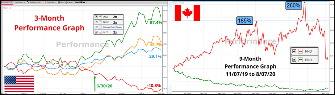
Look for Divergences Between Bullish and Bearish ETF Pairs
The Performance Graph makes it easy to spot and capitalize on divergences between ETFs that track the same market, but one is long, and the other is short. For example, on a 3-month Performance Graph, on May 14th, HOU, Horizon’s 2x leveraged Crude Oil Bull ETF, had crossed above HOD, the 2x Crude Oil Bear ETF. From there, HOU kept rising, gaining 39% to Tuesday, August 4th, pulling away from HOD which continued to fall. The Performance Graph showed the divergence both numerically and visually. Seeing the divergence, an investor could have stepped into HOU early on for a fairly smooth upward trend. Another choice, they could have turned to individual stocks in the Energy Sector and selected two or three positions with the best-looking chart patterns. Baytex Energy (BTE), for example, a former energy titan that once commanded $50 a share and now trades for mere pennies, managed a 76% gain during the period.
Click or tap image to enlarge.
Find Stocks that are Outperforming Their Industry Group
When you have a stock graph open, and you want to do a further study, click on the Performance Graph. The graph will automatically open with a comparison of the stock and its Industry Group in whatever timeframe you have set as a default. Has the stock outperformed its Industry Group, and by how much? Start with a longer timeframe and narrow it down to three months and even one month. For example, on August 4th, a three-month view showed the Building (Wood Products) Industry Group had surpassed Mining (Gold Silver) as the fastest rising Industry Group, a 54% gain compared to 41%. You can quickly add other Industry Groups from the top of the Industry Group Viewer that might be of interest for additional studies.
Watch this video to learn more. With a little practice, I am confident the Performance Graph will become one of your essential tools for analysis and making money in stocks. To learn more, view this short video titled, THE PERFORMANCE GRAPH MONEY-MAKING SECRETS.


Leave A Comment