

Do you prefer a daily or weekly stock graph? It’s like asking if you would rather have a window seat or the aisle. If you’re a window person, you probably like the less frequent interruptions and relative calm. A weekly graph that’s less busy and requires fewer decisions might suit you best. If you’re an aisle person, you don’t mind the extra bustle, preferring to stay alert and act quickly when the need arises, or just whenever you feel the urge. You’re a person who probably gravitates to the daily graph.
A bit of a silly analogy to get your attention. What you really need to consider is which graph period is better suited to your investment style. Which one will give you the desired results? What about your lifestyle? Many investors tell me they don’t want to be chained to their computer, micro-managing their portfolios. If that’s you, weekly graphs may be your best choice.
By the way, VectorVest’s exclusive Weekly graph is a huge advantage in that each candle or bar represents a full week’s worth of data from the beginning through the end of each week. This is valuable information for chart readers. The other, more common option is the “End of Week” graph which displays information from the last trading day of the week. Big difference between the two.
The advantages of a weekly graph:
- It gives you a clearer picture when studying price action over a long period, two to five years for example.
- It gives you a broader perspective and often makes breakout patterns such as channels, cup with handle, double bottoms, rounded bottoms and J-hooks jump off the page. Look at a 2-year weekly graph of Holly Frontier, HFC, in the US database for a terrific example.
- Weekly action can smooth out minor noise and volatility making it easier to hold your winners for an extended move. Investors watching their positions daily may be shaken out of a good stock by short-term volatility or even normal pullbacks.
- A surprise benefit perhaps, but a big one, is that psychologically it’s a lot easier for share owners to stay calm and make fewer impulsive decisions when looking at the weekly graph.
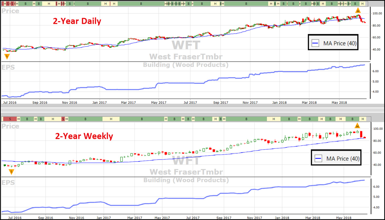
Let’s check it out. One of our most popular and best performing stocks in Canada is West Fraser Timber, WFT, a leader in the red-hot Building (Wood Products) Industry Group. Notice first how the default 1-year daily graph is quite choppy despite the overall bottom left to upper right move. On several occasions Price fell below its 40-day MA, a move that might have scared some investors out too early. Now change the period to a Weekly 2-year graph. Price has moved steadily up the page, never falling below the 40-week MA. RT is much smoother and hasn’t been below 1.00 since January 2017. Which graph is the window, and which one is the aisle? Which one better suits your investment style and your lifestyle?
Click or tap image to enlarge.
This is not to say the daily graph doesn’t have its place. The risk in using only one or the other is that an investor could miss something important or see it too late. You need them both. The daily graph is necessary to determine a follow-through day, both on the market and the stock, which confirms a new or continuing trend. Some patterns, breakouts and breakdowns can be spotted earlier on the daily, allowing the short-term trader to get in and get out earlier.
Your weekend homework.
Open the Viewers and study the 5-year weekly graphs of the top 100 stocks sorted by RS, Relative Safety. Include only Price, the 40-MA and EPS. What dates would you have gotten in? When would you have gotten out? Would you have made money? What patterns did you see? Pay attention to the slope of the MA — is it rising or falling? On a scale of 1-10, ten being the best, which stocks would you give a 10 today based solely on what you see? If you have the time and the desire, do the same using a 2-year daily graph. I would love it if you would share your observations with me about this charting method. What chart patterns did you find and what stocks you gave a 10? Leave your comments below. I’ll share the results in our weekly Tuesday SOTW Q&A webinar.
At the end of the exercise, you should have a pretty good idea WHICH IS BETTER FOR YOU: DAILY OR WEEKLY GRAPHS?


THis is great, i did not use weekly charts, I am going to start using. These posts are very educational. Thanks.